Applies to
CaptionButton component.
Declaration
type
TBtnOrder = -1..32767;
property BtnOrder: TBtnOrder;
Description
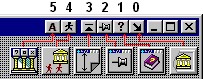
The BtnOrder property indicates position of caption button, the order in which buttons will be displayed. BtnOrder calculates from right side of title bar to left side (see screenshoot below).
Initially, the button order is always the order in which the components were added to the form, but you can change this by changing the BtnOrder property. The value of the BtnOrder property is unique for each ancestor of the CaptionButton on the form (like TabOrder property of ancestors of TWinControl). The first caption button added to the form has a BtnOrder value of 0, the second is 1, the third is 2, and so on. These values determine where a control is on the title bar.
If you attempt to give a button a BtnOrder value greater than the number of caption buttons on the form minus one (because numbering starts with 0), AppControls won't accept the new value, but will enter the value that assures the component will be the last in the button order.
The caption button with the BtnOrder value of 0 is the custom button which placed on right side of title bar, after regular system buttons.
 To separate the buttons by additional empty space - use SeparatorWidth property. For example screenshoot below shows that acAppAutoRun component from the AppControls pack have either BtnOrder and SeparatorWidth = 4 pixels.
Screenshoot (orders of buttons)
See also
SeparatorWidth property.
File not found.
 BtnOrder property