 TacImagesComboBox component
Hierarchy Properties Controls with attached label


|
TacImagesComboBox component
Hierarchy Properties Controls with attached label |
|
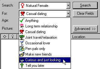
| The acImagesComboBox is the enhanced combo box which lets you to specify images for every item of the drop-down list. Also it contains the AttachedLabel structure which lets to operate with the label associated with the edit control and specify its behavior and position near the control.
|
| First you need to specify the ImageList which contains the images which should appears beside individual items of combo box. Point the list of images at Images property (note that if image list is not specified the combo box will show just plain strings). The height of the combo box will be automatically adjusted accordingly to the height of images.
|
|
|
| To specify the text and image indexes for portions of the drop-down list — use Items property. The image index should be specified as integer number and separated from the text of item by "|" character. For example, if the Items contains the line: '0|The Item', this means that item should display text "The Item" and use first image specified in the image list (with index = 0). If the image index is not specified it will show only text without image.
|
|
|
| Example
|
| acImagesComboBox1.Items.Add('0|First item (imageindex=0)');
|
| acImagesComboBox1.Items.Add('Item without image');
|
| acImagesComboBox1.Items.Add('1|Another item (imageindex = 1)');
|
|
| acMRUComboBox component.
|